les bulles
corporate design for a new swiss champagne retailer. the company is based in the zurich area and offers champagne and other specialities from the champagne region that are not (yet) known to everyone and are of uncompromising quality.

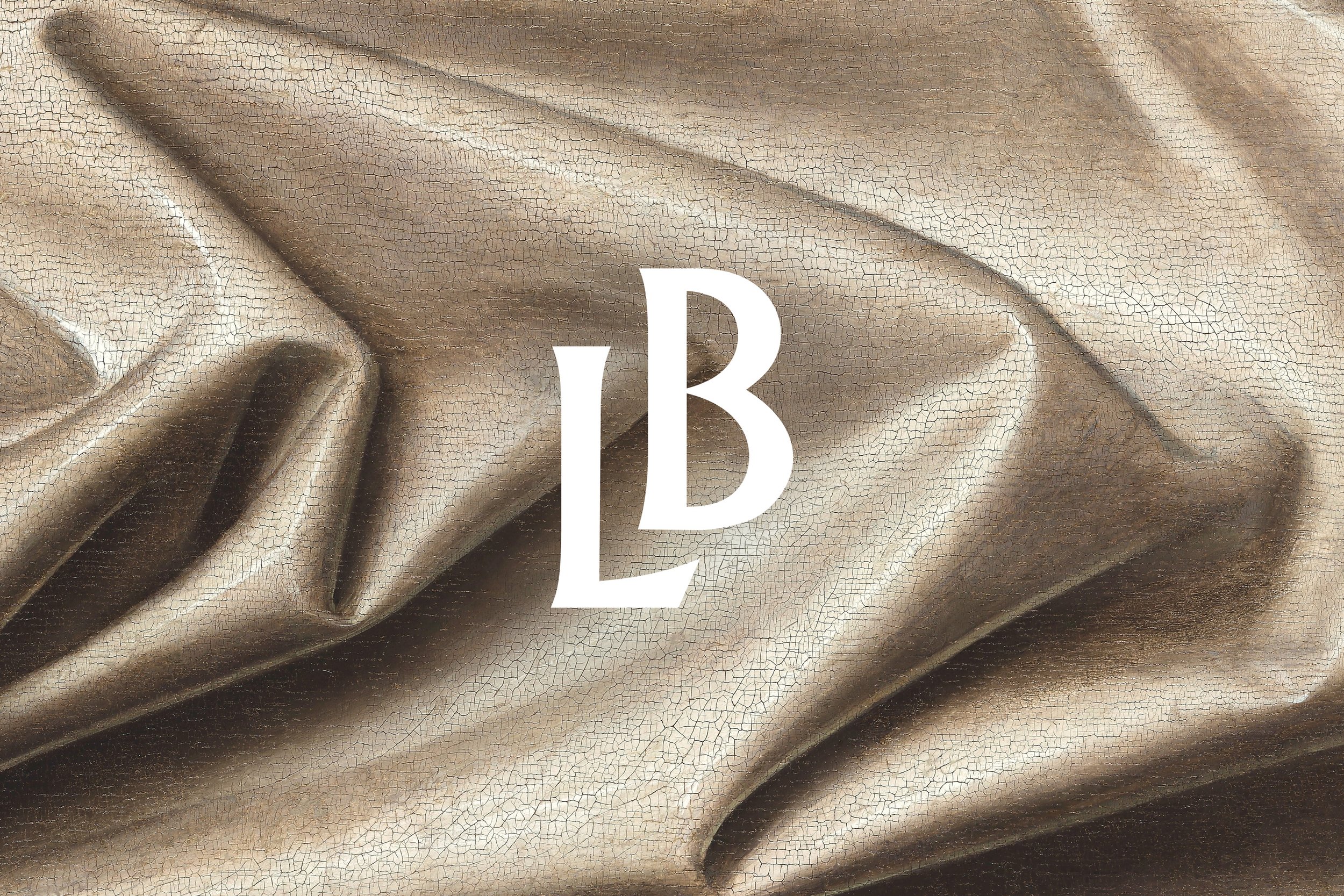
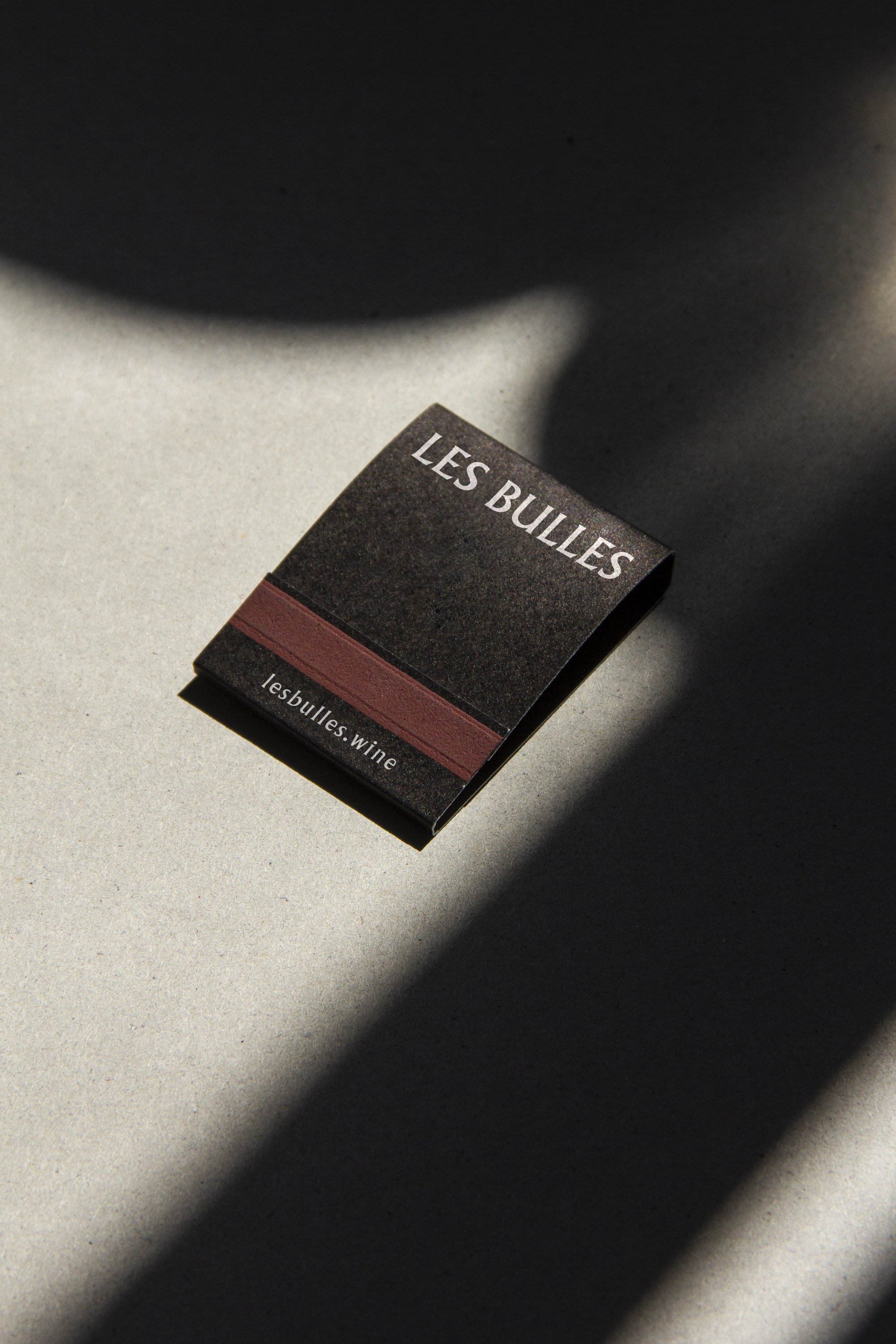
the logo is based on a font that was created in the 1920s and 30s, the heyday of champagne. in large formats it has a very unique character, while at the same time it retains good legibility in smaller sizes. fine materials and embossing as well as a specially created monogram, which is derived from the word mark, give the brand a high-quality appearance.


since the company cultivates a very personal relationship with its mostly young winemakers, a trip was undertaken to the vineyards with the renowned photographer zsigmond toth. the result is a series of photo reports that provide an intimate glimpse behind the scenes of the production of the fine champagnes.


besides the reportage photography, the website also features original details from oil paintings by old masters, both of which provide a sophisticated contrast to the otherwise usual imagery of the wine industry. the glossary on the website deserves a special mention: complicated terms from champagne production are explained and conveyed here with humour and in a light manner.

credits
concept, art direction & design: studio marcus kraft; project lead & texts: florian schmidt-gabain; photography: zsigmond toth